Forte Training Club
I worked with Forte Training Club to develop and new logo and brand identity for their gym. I couldn't be more proud of how this direction turned out. From the star icon, symbolizing every gym member and their limitless potential to grow, to the bright green that pulls from both Australia's national colors, and the Brazilian flag - the founder's home country.
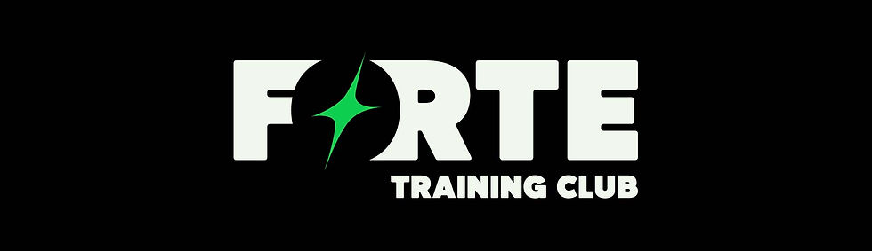

The logo and icon have gone live across Forte's website, app, and within the gym and members are loving the fresh and exciting feel of it.


Other Top Contenders
I personally loved the squiggly bar concept. Pedro had a vision for a gym that was more fun, welcoming, open to all and didn't take itself too seriously like competitors. I thought the added movement of the curved bar took away from the intimidating nature of weight lifting.

Anyone who has been to Forte has met Sunny, the beloved french bulldog that cheers everyone on in the morning and fearlessly battles against the medicine balls. With Sunny being such a well known figure at the gym, combined with Pedro's desire to be different and more welcoming, we both loved the idea of hero-ing Sunny. However, to passersby on the street, this logo might give the impression of a dog training class, so we decided against it.

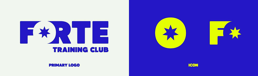
These two logos were top contenders at the end, but were ultimately beat out by the sleekness and magnetism of the final logo.



Comments